Rebuilding a small-business digital foundation in 36 hours
Summary
AAA Brick Mailbox Co. lost its website, but it needed more than a website recovery. Its legacy site was a sliced up image, thus unusable on mobile and all site text was inside images. Its photo gallery was also empty.
I reframed the job as a rebuild and took it from consultation through design, development, QA, and launch in about 36 hours. I prioritized mobile usability, search preservation, and gave customers a way to see the company's amazing custom masonry work.
AI accelerated my concepting, implementation, image work, and QA, letting me get the company back up and running in <2 days.
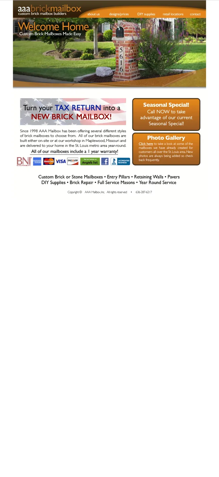
Before
- Website built from sliced images, circa 2011
- No mobile layout; the desktop page shrinks to fit
- Empty photo gallery
- All text, including email and phone, trapped inside images
- No SEO or structured metadata
36 hours later

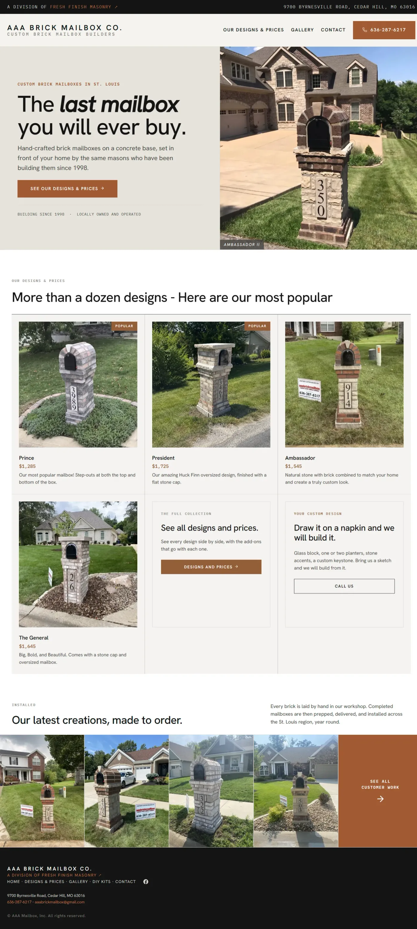
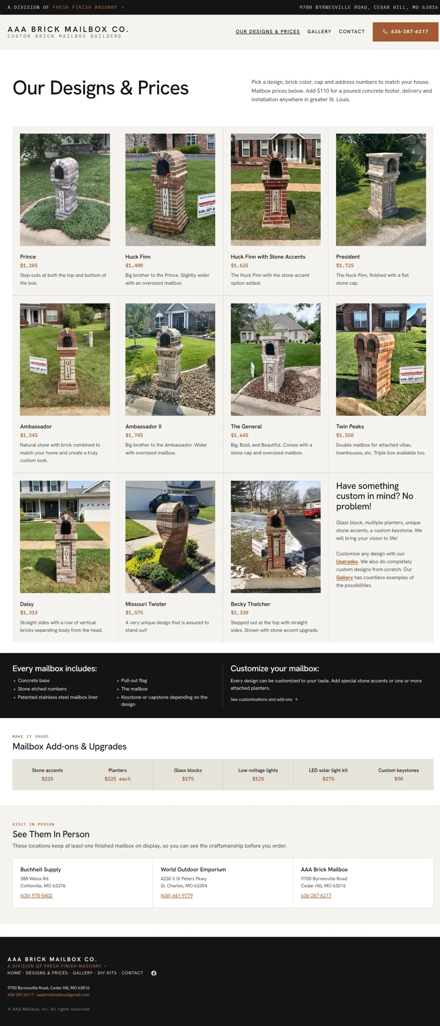
After
- Mobile-first and responsive
- SEO, structured metadata, ready for AI interaction
- Tap-to-call and email throughout
- Gallery with 75+ images
- Analytics and tracking built in
The Problem
A site that barely worked
I first found AAA Brick Mailbox as a prospective mailbox customer through Google reviews. I was soon genuinely confused because while the reviews were recent, the company’s website appeared to be
abandoned., read moreRead less
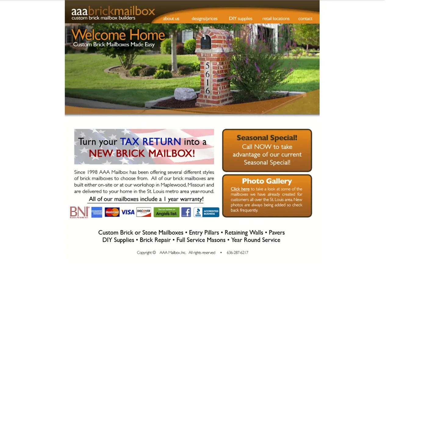
Per WaybackMachine, the site was built in 2011.
There was no mobile experience and the website appeared to be composed entirely of images with text embedded inside the images.
For example, even the email address featured prominently on the homepage was part of an image, so you couldn’t tap or copy it. Further, when I emailed the address, there was no response form the company, but also no bounce.
Digging in a little further, I found no SEO metadata, no structured data, no visible analytics, and no support for accessibility.
I reached out to the owner, described what I was seeing, and talked about the benefit of making some improvements. He was interested but there was no immediate timeline, just a qualified lead for me.
A couple of weeks later he called unexpectedly and wanted to move forward immediately due to
an urgent problem., read moreRead less
The site’s hosting contract had run out and the provider had disabled the site, removed its security certificate, and was aggressively upsell the owner a collection of additional services to get everything running properly again that he didn’t know if he needed or not.
He knew enough to recognize that he was outside his comfort zone and likely being taken advantage of.
The owner wanted to meet the same day, which we did.
Making the case to rebuild
Before he arrived, I used the brand new Claude Design app to rough out a modern concept I could put next to the existing site. I wasn’t trying to design the finished experience in an hour. I wanted to put two choices in front of him: repair what he had or
see what it could become., read moreRead less
The owner’s immediate goal was straightforward: get the site working again and make a few overdue updates, including correcting the email address and adjusting product prices.
That would have solved the outage, but not the website. Most of the problems that made the old experience outdated, difficult to use, and a poor reflection of his business would still be there.
Side by side, the difference between the original site and 1 hour concept was obvious. The concept showed what the same business could look like with responsive layouts, clear calls to action, readable content, and photos of his amazing work doing more of the selling.
Once he could see the two experiences together, the conversation immediately shifted away from repairing to replacing.
Priorities
This was going to be a time-driven project. The owner needed the site up. There was no time for customer research. The site, poorly done even 15 years ago, had zero analytics to get insights from.
I worked from three sources:
- A 90-minute meeting with the owner to understand his needs and how he saw his customers
- My own perspective as his prospective customer
- Experience designing and building numerous consumer-facing experiences
I had enough to make a set of low-risk decisions and move quickly.
1. Mobile-first
I had no analytics, but this was a consumer-facing local business so I expected mobile to account for the largest share of traffic. I treated it as the primary experience from the start.
2. Protect search ranking
The old site had almost no meaningful SEO, but it already ranked well for important local searches, despite ample competition.
The rebuild could not put that visibility at risk.
I kept the search foundation intact and filled in what the old site was missing:
- Preserved the simple information architecture
- Converted products, prices and descriptions from graphics into actual text and semantic content
- Added SEO-friendly page slugs and plugged in permanent redirects
- Added metadata for SEOs, sharing, LLMs and schema.org structured data
- Added a sitemap, crawler guidance
3. Showcase the product
The owner had years of strong masonry work sitting on his phone, but none of it was visible on the site.
With the existing photo gallery empty, he resorted to texting customers individual examples. For customers, that was
tough way to shop., read moreRead less
Changing the brick, stone, shape, and other details could completely change the character of the finished mailbox. This mason’s gallery should:
- Show the creative range of what was possible,
- Give customers ideas for their own property,
- Let the craftsmanship sell the product
- Create clear credibility.
I gathered the owner’s photos from his phone, texts and Facebook, removed weaker and repetitive shots, and ultimately built the gallery with 75+ examples of completed work.
4. Table everything else
Shipping the new site quickly also required deciding what did not need to be in the first release. Deferred items could be worked after MVP was launched.
- Per the owner, DIY parts rarely sold, so I deferred that page.
- I also deferred the standalone Contact page. In the new design, corrected phone and email were already prominent above the fold and repeated throughout the site. Customers could reach the business without it.
- The gallery didn’t need to be perfect. We can cleanup images, tweak photo order, etc, later.
- We tossed around many other ideas like a lead form on the website (instead of email), a FAQ page, integrated social feed, etc. All cut in favor of progress over perfection.
Building
Designed to stay simple and maintainable
I would be taking over website hosting, so I worked the environment setup and domain setup in parallel with building out the site locally so infrastructure woulds not become a blocker at launch time.
For the site itself, I used WordPress and deliberately avoided file-based customizations.
Using a stock vanilla template and putting all the custom work inside the DB meant WordPress upgrades would not overwrite files and breaks would be highly unlikely. That choice quickly paid off, as shortly after launch WordPress released a major new version. The upgrade for me was a single button click but nothing breaking.
Building in Wordpress also leaves the owner or his designate a standard admin interface to maintain the content solo if they desire.
The layout and colors for the site stayed intentionally straightforward: Masonry-inspired colors, brick-toned calls to action, and a simple block-based layout.
The site’s visual design is not trying to be a showpiece. It is meant to be clean, credible, maintainable and appropriate to the business.
AI as an accelerator
AI materially increased how quickly I could work, but it did not make the decisions.
- Claude Design helped me generate and compare early visual directions.
- Claude Code accelerated page builds and repetitive styling changes across the site.
- Nano Banana 2 helped me clean up about 30 gallery images after the MVP launched, removing people, tools, standing water and other distractions. I never altered the mailbox itself.
- AI tools also helped with image processing, alt text and QA across links, accessibility and SEO.
I still reviewed and corrected the output. Early design passes added unnecessary UI and copy, and some automated image processing was too aggressive.
Results



Launch and follow-up
The core site went live in roughly 36 hours.
During the following week I added the lower-priority pages, refined the gallery, optimized images, reviewed alt text, tightened structured data and finished the remaining polish.
The initial release was intentionally focused on the parts that mattered most. The rest could follow without delaying launch.
What the data shows
The old site had no analytics, so there is no credible before-and-after comparison.
Within 60 days of launch, 78.9% of traffic was mobile, supporting the decision to treat mobile as the primary experience.
Visitors were also spending about three minutes on the Gallery page, suggesting they were taking time to browse the work.
The site now has a baseline for measuring what customers actually use.